You are using an out of date browser. It may not display this or other websites correctly.
You should upgrade or use an alternative browser.
You should upgrade or use an alternative browser.
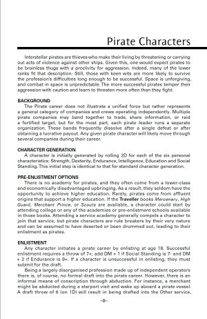
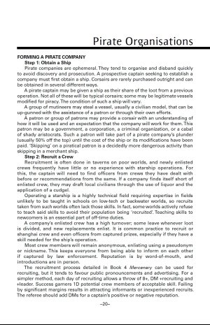
Book 9: Pirates preview
- Thread starter MongooseMatt
- Start date
Enoki
SOC-14 1K
Ral Ranta - Traveller
ZhodaniBob
SOC-1
I cannot wait for a new, hard copy Little Black Book! Will it have Mongoose's typical contemporary groovy art or line art from the 1980s?
I am a PDF-first reader for Mongoose, so LLBs are perfect for my tablet. Well done, mate!
I am a PDF-first reader for Mongoose, so LLBs are perfect for my tablet. Well done, mate!
David Deitrick is still around.
 www.facebook.com
EDIT: I don't know why it's showing in German.
Bei Facebook anmelden
Melde dich bei Facebook an, um dich mit deinen Freunden, deiner Familie und Personen, die du kennst, zu verbinden und Inhalte zu teilen.
 www.facebook.com
EDIT: I don't know why it's showing in German.
Last edited:
We are emulating the line art of the Classic eraI cannot wait for a new, hard copy Little Black Book! Will it have Mongoose's typical contemporary groovy art or line art from the 1980s?
Nice! Keithian pen scratchings!We are emulating the line art of the Classic era
yeah, for me that IS what Traveller is: B&W line drawings. For me it allows for more imagination, but it is also nostalgia talking I'm sure. While I do like some of the more recent takes on Traveller art (definitely not all, but art is very personal I feel), it is the old line drawings that draw me in the most and feel like Traveller.Nice! Keithian pen scratchings!
An actual real LBB-style, staple-bound book!
I went ahead & pre-ordered and hoping for the best. I've done a quick overview in my blog but have yet to roll up a character to see how that goes. But overall, I liked it and it really seems a lot like the original CT stuff.
only real nitpick is the tables, though attempting to be like the originals, just seem a bit off to me in terms of formatting. Not sure why. though I do like the cascade skills being bold - that is a nice touch. Waiting for the actual physical copy and hoping the quality is there.
And like Sir Brad - eagerly waiting and maybe I can convince my group to let me run Traveller again. Pirates may be a better approach as they felt too constrained by the Imperial law last game we tried.
First off let me say I'm going to buy this, probably a couple copies.
I've seen the previews, and the pages look a little off. They type face is a little fainter and thinner, and the page dimensions look a little off.
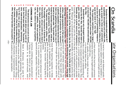
These previews are a little higher quality, so I feel more confident in posting this, a page from an OG LBB adventure overlaid on a preview page.
I matched the column width, and lined them up using the page number as an alignment mark.
As I mentioned, there seems to be a difference in the font, the OG seems bolder, and the spacing line spacing on the new one seems a little tighter than the OG.
After I get a physical copy in hand I'll see how it compares to the older ones I have.

Don McKinney told me once that the font in Classic Traveller was Univers 55.
I've found that BT Zurich Roman at 8.5 point in Microsoft Word is visually identical to the font in The Traveller Book.
Univers was created by Adrian Frutiger in Zurich, Switzerland in 1957.
Which is why we see clones of Univers called Zurich and Frutiger.
All of them should be somewhat interchangeable, except maybe in boldness and italicizing.
The Pirates book really just looks to need to be a bit bolder or a heavier print thickness. The line spacing might only be o.01 off from the LLBs.
I'd always heard Optima, and it's pretty close.
But Univers 55 looks closer. It could be just a little bolder, and a couple of the letters might be a little off, like the top of the T is a little thin. But that could be down to the font package differing from the typesets that were probably used back in the day.
But Univers 55 looks closer. It could be just a little bolder, and a couple of the letters might be a little off, like the top of the T is a little thin. But that could be down to the font package differing from the typesets that were probably used back in the day.
I have heard the LBB's were printed on a Linotype: https://en.wikipedia.org/wiki/Linotype_machine
Might be difficult to match in modern desktop publishing.
Might be difficult to match in modern desktop publishing.
Black Vulmea
SOC-12
I'm in. 
Loren explicitly stated so.I have heard the LBB's were printed on a Linotype: https://en.wikipedia.org/wiki/Linotype_machine
Might be difficult to match in modern desktop publishing.
Similar threads
- Replies
- 12
- Views
- 272
- Replies
- 43
- Views
- 2K

