• Welcome to the new COTI server. We've moved the Citizens to a new server. Please let us know in the COTI Website issue forum if you find any problems.
  • We, the systems administration staff, apologize for this unexpected outage of the boards. We have resolved the root cause of the problem and there should be no further disruptions.

Starship Corridor

corridor-06b.jpg


Trying to work on my texturing skills.
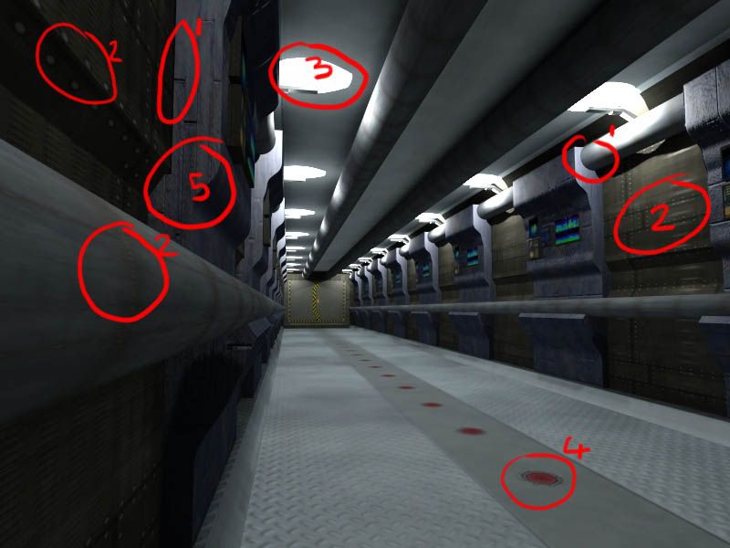
This is a corridor from a large ship or Station. This could be a corridor that links the inhabited areas to Engineer, skirting fuel or cargo holds.

Spline work on the consoles - a traced the shape, extruded it, then applied some textures.
The pipes are just cylinders with a texture.
The corners of the ceiling are chamfered and the ceiling itself has a texture applied.
The pressure hatch at the end of the corridor is just a texture.

Lighting is done with IES lights.
Almost all textures have a BUMP map, giving it a pseudo 3D appearance.
Pure metallic surfaces have specularity added.

I'm not 100% happy with it, but I only spent a few hours on it.
If I was doing this for publication, I'd have spent more time with the textures.
Maybe putting a very complex series of textures together to vary it more.
Maybe add some softly glowing lights along the floor and more stickers or labels or signs on the walls.
Maybe some directional flow arrows on the pipework, too.

Also, this is 'clean' - I'd want to take the time to dirty it down and add wear-n-tear to the surfaces. Maybe some steam leaking from some pipe seams (done with Particles).


Rendered with 3ds Max 2009 and Mental Ray.
 
My only comment of worth (or not) is on composition. Too many repeated elements. No way I see a reason for a full display panel every 1.5m (just a guess) in that corridor :) Repeated lighting elements sure, not an issue. Presuming of course that some of your dirtying up might include a burnt out one and maybe a dimmed one or two (sloppy maintenance and/or poor quality control in the game, but great for atmosphere).
 
Nice. And I see you have Total Textures 7 :)
Heheh.. yup.


My only comment of worth (or not) is on composition. Too many repeated elements. No way I see a reason for a full display panel every 1.5m (just a guess) in that corridor :) Repeated lighting elements sure, not an issue. Presuming of course that some of your dirtying up might include a burnt out one and maybe a dimmed one or two (sloppy maintenance and/or poor quality control in the game, but great for atmosphere).
This is as close as I could get to a reference image that came with a disc of textures that I got (see above). I got very sloppy towards the end and rushed through the scene. I'd like to take a small ship interior and do it proper. Nice and grimey.


I like it. I think it's better than most of the other amateur stuff I've seen.

Good job!

Thanks!

Thanks to everyone for replying...
 
Some comments:


On first glance, this is a nice, atmospheric pic. Interesting geometry too, which is difficult to do with a utilitarian corridor. I agree that it is repetitive but doing away with some of the control panels on the bulkheads would cure that. If the wall segments were purely meant to be bulkheads then it would make sense and the repetetiveness of it wouldn't jar so much. I like the lighting in this piece. Nice soft shadows - as opposed to the usual, horrific, I've-got-a-ray-tracer-and-I'm-going-to-use-it, razor-sharp, solid black shadows you get in 3D pieces.

My comments are more concerned more with textures and lighting as that's what you say you were practicing. I've ringed some areas on the attached image. Comments follow:

1: Ambient occlusion. Much of the level feels like it has an ambient occlusion pass on it - the shadows that build up in nooks and crannies - but there are still areas that have razor-sharp edges where they meet. If there is an occlusion pass on the model, I'd recommend modelling in connecting collar sections to make it look more convincing than simply having the tube clip through the box, as it were.

2: Texture stretching. Try to keep your tiling proportions close to 1:1 or you get wierd and unconvincing stretching like the areas ringed.

3: Something wierd is going on with the lights. They have aliased edges. This is probably a raytracing filter thing.

4: over-reliance on textures. I'm not sure what these things on the floor are but they look printed-on or like stickers. Textures can do a pretty good job of replacing modelling at middle-distance to far-distance ranges, but up close they break badly. This applies to bump mapping aswell. If the camera is going in close, use geometry instead.

5: Slapped on textures. The texture ringed makes no sense. It looks like bricks but again stretched (given away by the thicker and blurred end gap) and it doesn't fit the shape of the object, they start half way through at the wall and then just clip off the edge of the unit. My suggestions are to either make a texture that follows the form of the object or simply apply a light noise texture for a plain but still live surface.
 
Lovely job...clearly this is not a player's ship...otherwise we are missing the jutebox, strobe lights, etc. Very nice...thanks for bring a visual image of what previously only existed in my head.

Hunter, Marc, et al. you see this what Traveller needs...lots more dedicated people like this updating and revising the Traveller Universe.
 
Back
Top