• Welcome to the new COTI server. We've moved the Citizens to a new server. Please let us know in the COTI Website issue forum if you find any problems.

Non OTU: LBB S3 Spinward Marches (re)mapping in 1105

Don't forget...

Ag - Ri - Ni and Na - Ni - Po worlds.
Ah, but that's the beauty of my scheme to "banish" the Non-industrial indicator to the italics font in the world names! That way I don't have to assign a color stripe to Non-industrial trade codes! Helps to limit the opportunities of the dreaded "triple color stripes" in the same world icon circle you see. 🤫
 
According to CT’s rules for what qualifies as a Rich world (which does NOT match the qualities needed for T5!), both Tarsus and Pavabid do NOT qualify as Rich worlds in District 268.
The Rich trade classification is not the only one that differs between CT and T5; other differences between CT and T5 can be found in the Industrial, Non-industrial, Water world, Desert world, and Barren world trade classifications.

Worse yet, I don’t think that there’s a way to “fix” this particular problem with a coding extension of the Travellermap API such that an option checkbox gets added to include the additional Government code limitation on Rich worlds used in CT.
What would be needed is for Joshua to add a new option to the SEC data API for selecting trade classification rules — perhaps something like tradeclass=SecondSurvey (for T5 trade classification rules, which would be the default for /data/ URLs) and tradeclass=Legacy (for CT trade classification rules, which would be the default for /api/ URLs).

Also had to fix the Government codes and “ownership” attribution for Elixabeth and Talchek so they reported as being colonies (code: 6) of Forine as published in LBB S3. Travellermap has an incorrect attribution of “ownership” for Elixabeth pointing to Dallia (O:1335) instead of Forine (O:1533) as stipulated repeatedly in the Travellerwiki page for Elixabeth. A transposition typo, I'm sure. 😉
I wouldn’t be surprised if the name Elixabeth were originally an “off-by-one” typographical error for Elizabeth, since X is a neighbor of Z on a QWERTY keyboard layout.
 
I wouldn’t be surprised if the name Elixabeth were originally an “off-by-one” typographical error for Elizabeth, since X is a neighbor of Z on a QWERTY keyboard layout.
I agree.
But it's also a cool "off by 1" error ... so might as well keep it as OTU canon. ;)


Wanted to test if my theoretical notion of altering the font of mainworld names to differentiate Non-industrial worlds through image editing using the Preview application on my M2 iMac and found that I can basically update 6 world names before needing to save, close, reopen and keep going. This is because I need to copy paste a "block of black" to cover up the name provided by the Poster Maker and then annotate a replacement bit of Text to stack on top of the "block of black" with the requisite italics or with underlined italics in the mainworld name.

To be extremely specific, using the .png image generated by the Poster Maker API, I need to scale the Text annotation down to 5 pt font size to match the size of names already on the map and I need to use bold on everything by default to match the overall styling.

I tried doing the "name replace" without bold modifying the italics and although it looked "okay" when zoomed in really close, as soon as you began to zoom out on the image the lack of bold on the text became a pretty severe liability and "legibility defect" in the presentation of information. It just made world names harder to read than necessary ... so I scrapped the non-bold italics and started over with bolded italics and worked my way through the Qronor subsector as a Proof Of Concept Implementation.

Anyone who has been following me along on this journey and has an interest in this kind of modification to Sector Map presentation, feel free to share your impressions and opinions on the difference that this subtle little change in presentation of information makes for you.


Eighteenth step revision: Imgur Link (3602 × 5209 png image) (recommend opening in new tab)

This increment includes editing of the Qronor subsector to include use of italics as well as underlined italics for mainworld names as markers for Population: 5-6 as well as Population: 4- UWPs respectively. In CT, both are recorded as being Non-industrial, but Population: 4- worlds receive -DMs to passenger and cargo quantities bound for those destinations.

From here, the idea is to work my way through the rest of the subsectors, modifying the fonts for mainworld names to fit this revised convention before moving on to the task of updating World Colors to a new scheme also.
 
Nineteenth step revision: Imgur Link (3602 × 5209 png image) (recommend opening in new tab)

This increment includes editing of the Jewell subsector to include use of italics as well as underlined italics for mainworld names as markers for Population: 5-6 as well as Population: 4- UWPs, respectively.


Since these image edits are "easier" to do than needing to crosscheck a mass of UWP data for typos+errors and a huge steaming pile of who knows what else ... I'll be able to pick up the pace and do more than one subsector per day, so hopefully the updates will happen more frequently for a little while here.
 
Twentieth step revision: Imgur Link (3602 × 5209 png image) (recommend opening in new tab)

This increment includes editing of the Regina subsector to include use of italics as well as underlined italics for mainworld names as markers for Population: 5-6 as well as Population: 4- UWPs, respectively.
 
while I am enjoying this (though unlikely to use but it is interesting and also wonder how you have the time!) I will note, as I have previously in the forum, that adding new standards is always interesting (as in the italics and all that).

standards.png
 
Twenty-first step revision: Imgur Link (3602 × 5209 png image) (recommend opening in new tab)

This increment includes editing of the Aramis subsector to include use of italics as well as underlined italics for mainworld names as markers for Population: 5-6 as well as Population: 4- UWPs, respectively.


Well that got interesting really fast. :oops:

With the previous 3 subsectors, there weren't all that many Non-industrial worlds in the mix. I was basically needing to do 3 cycles of edit/save/close/reload to finish off a subsector's edits. Technically I was doing about ~15 worlds per subsector (on average) until hitting the Aramis subsector.

Aramis subsector has 26 worlds.
  • 11 worlds are Population: 4-
  • 11 worlds are Population: 5-6
  • 2 worlds are Population: 7-8
  • 2 worlds are Population: 9-A
I needed 4 cycles of edit/save/close/reload to finish off the edits to this subsector.
22 of the 26 worlds here are Non-industrialized ... which is kind of staggering when you stop to think about it. The Aramis subsector in 1105 is something akin to a "barely populated archipelago" with just a couple islands that have staggering populations on them.

If you want a "backwater frontier" setting for a campaign (set in the Spinward Marches), the Aramis subsector can make for a really interesting location to go "sightseeing" in ... but I wouldn't want to have to turn a profit on speculative goods trading here on a regular basis. Just not enough variation in trade codes to set up a really good supply chain round robin.


standards.png


Pretty much.
However, it's also fair to say that Traveller Sector Map Presentation of Useful Information™ has been somewhat needing a refactoring overhaul for quite some time now in order to make it both better and more visually accessible.

There's also the fact that sometimes in order to demonstrate you've got a better idea of how to do things ... you have demonstrate that idea (so that's what I'm doing, step by step). That way it is possible to Peer Review what I'm doing as I'm doing it so as to offer opinions, feedback and suggestions.

also wonder how you have the time!
I "steal" time in snippets so I'm not trying to do everything everywhere all at once in a single sitting.
 
Wanted to test if my theoretical notion of altering the font of mainworld names to differentiate Non-industrial worlds through image editing using the Preview application on my M2 iMac and found that I can basically update 6 world names before needing to save, close, reopen and keep going. This is because I need to copy paste a “block of black” to cover up the name provided by the Poster Maker and then annotate a replacement bit of Text to stack on top of the “block of black” with the requisite italics or with underlined italics in the mainworld name.

To be extremely specific, using the .png image generated by the Poster Maker API, I need to scale the Text annotation down to 5 pt font size to match the size of names already on the map and I need to use bold on everything by default to match the overall styling. […]

Anyone who has been following me along on this journey and has an interest in this kind of modification to Sector Map presentation, feel free to share your impressions and opinions on the difference that this subtle little change in presentation of information makes for you.
It’s a shame that the Poster API doesn’t also provide an option for .svg output; updating a SVG image can be done in a text editor (its internal format is not unlike HTML, and it uses CSS for styling). I’d made a .svg of the Gemini subsector of the Solomani Rim as an experiment a few years back, and used cursor hovering to display certain information (e.g. if the cursor is hovered over the world in the center of a hex, it displays the world’s hydrographic information and trade classifications; if it’s hovered over the starport letter in a hex, it displays the UWP of the world; &c.). I’d made my own style (though still using Univers, Optima, and MICR typeface clones) rather than making an homage to one of the Traveller Map styles. It wasn’t nearly as trade-oriented as the style that you’re developing.
 
It wasn’t nearly as trade-oriented as the style that you’re developing.
I keep thinking that a trade-oriented sector map makes a pretty darn decent "lowest common denominator" that provides such a (useful) wealth of information at a glance for the widest possible range of uses, including casual travellers (among others).

There's also the combination of two notions that are prompting me to do this:
  1. This is why we can't have Nice Things™.
  2. If you don't make any Stuff you'll run out of Stuff.
Put those two notions together and you get the following:
  • If you want something done, you've got to do it yourself. 😫
The difference is that I figure that when I get done with this project, it's going to make Such A Great Resource™ that more people than just myself are going to feel motivated to want to use it and/or harvest ideas from it to take Travellermap "to the next level" as a resource for all Traveller Referees and Players with an interest in the Spinward Marches sector in 1105. 🤔
 
Twenty-second step revision: Imgur Link (3602 × 5209 png image) (recommend opening in new tab)

This increment includes editing of the Qrerien subsector to include use of italics as well as underlined italics for mainworld names as markers for Population: 5-6 as well as Population: 4- UWPs, respectively.


Being able to SEE all the Non-industrialized worlds on the sector map like this is starting to give me some pretty serious appreciation for both the "frontier-ness" of these subsectors and a sense of just how widely scattered and fragmented the population centers are across the map. It's really subtle but I'm already sensing a ... shift ... in how I think about potential trading opportunities and routes in various locations from the perspective of a small time tramp free trader, just by being able to "see" where the Non-industrialized worlds are with their smaller population numbers. 🪐🚀✨
 
It’s a shame that the Poster API doesn’t also provide an option for .svg output; updating a SVG image can be done in a text editor (its internal format is not unlike HTML, and it uses CSS for styling).
Whoops — mea culpa! The Rendering APIs do provide an option for .svg output: the accept=image/svg+xml option can be used with all of the Tile, Poster, and Jump Map APIs. If the SVG elements are well organized within the .svg files when this option is specified, then it should be much easier to modify the styles of mainworld names in .svg images than in their analogous .png images.
 
Whoops — mea culpa! The Rendering APIs do provide an option for .svg output: the accept=image/svg+xml option can be used with all of the Tile, Poster, and Jump Map APIs. If the SVG elements are well organized within the .svg files when this option is specified, then it should be much easier to modify the styles of mainworld names in .svg images than in their analogous .png images.
🤔 Tell me more ... 🤔
 
I keep thinking that a trade-oriented sector map makes a pretty darn decent “lowest common denominator” that provides such a (useful) wealth of information at a glance for the widest possible range of uses, including casual travellers (among others).
Attached is a .png of the style that I’d used for the Gemini subsector. My design goal was more oriented to a navigator’s perspective. The world colors relate to the world’s hydrographic percentage (the darker the blue/green, the higher the percentage), with the “backslash” overlay on some worlds representing “no dipping for unrefined fuel” (because the hydrographic percentage was too low); the nasty off-chartreuse (e.g. Hanumān) representing a world with fluid oceans; and a light tan (e.g. Parsifal) representing a desert world. Asteroid belts (e.g. Castor) are represented by a dot pattern in a “world” shape.
 

Attachments

  • Gemini_subsector.png
    Gemini_subsector.png
    116 KB · Views: 5
I’ll have to try downloading a subsector as a .svg image using the Poster API to see what the .svg image’s internal organization is like.
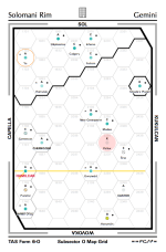
As a test, I’d downloaded the Aramis subsector of the Spinward Marches as a .svg image using this URL, with a milieu of M1105, a style of print, and an accept of image/svg+xml. The internal organization of the .svg image is unfortunately decentralized; the styles are explicitly applied to each text element rather than centralized by class types in a CSS section. For example, here is the text element for the world named Towers in hex 3103:

<text font-family="Arial" font-size="0.21" font-weight="bold" text-anchor="middle" x="0" y="0.45925" fill="Black">Towers</text>

In this case, the typeface is specified as Arial, the typeface weight is specified as bold, the “text-anchor” (i.e. horizontal alignment relative to the point given by x and y) is specified as middle, and the “fill” (in this case, the text color) is Black (standard color names are case-insensitive). Had there been a centralized CSS section in the .svg image, a “world-name” class could have been defined as having particular font-family, font-weight, and text-anchor properties, so that each world name text element could have been specified more concisely as

<text class="world-name" font-size="0.21" x="0" y="0.45925" fill="Black">Towers</text>

so that the font-family, font-weight, and text-anchor properties wouldn’t have to be explicitly given for every world name text element. But since they are explicitly given for each world name text element, the file is more verbose than it could have been. You could still define your own classes in a CSS section so that e.g. a “non-industrialized” world name class could be italic (using the font-style property) and underlined (using the font-decoration property), but you’ll need to create a CSS section near the top of the document to define whatever classes you’d like to add, and apply the class to each appropriate world name text element. I’d guess that even in its decentralized state, updating the text of the .svg image would take less time than updating the equivalent .png image.
 
Last edited:
I’ll have to try downloading a subsector as a .svg image using the Poster API to see what the .svg image’s internal organization is like.
Document the steps for me so that I and anyone else can replicate what you're doing, in addition to being able to "dig into" the encoding so as to be able to make these kinds of custom edits and changes via coding as opposed to image editing like I'm doing right now.
My design goal was more oriented to a navigator’s perspective. The world colors relate to the world’s hydrographic percentage (the darker the blue/green, the higher the percentage), with the “backslash” overlay on some worlds representing “no dipping for unrefined fuel” (because the hydrographic percentage was too low); the nasty off-chartreuse (e.g. Hanumān) representing a world with fluid oceans; and a light tan (e.g. Parsifal) representing a desert world. Asteroid belts (e.g. Castor) are represented by a dot pattern in a “world” shape.
Yeah ... that formulation is something that I (personally) find difficult to read/discern details in. The step changes are "too subtle" to be readily apparent (darker blue/green scaling) and I have to actively WORK to make sense of other bits of information buried in that format of presentation.

Also, as a navigator, it's not enough to know that you CAN go somewhere ... you also need to justify WHY you would want to go places "in generic/general" terms. What is AT these various locations on the map that would motivate you (or anyone else) to want to either go there or want to avoid going there in favor of a different route? As soon as you start getting into any kind of "traveling salesman" problem (tramp free trader, anyone? :rolleyes:) then just simply knowing if wilderness refueling is available becomes rather wholly inadequate to the task of plotting the Best Route™ between Here and There (which ought to be the Navigator's job).

The Captain would probably want to look at a map and make decisions based on "opportunities along the way" ... and for that you need two additional pieces of information for every world. You need to know what "population range" is to be found on worlds along with what trade codes they have (just in case Speculative Cargo opportunities present themselves).

This is why I take the position that a "trader's map" like the kind I'm currently generating in this thread "does all of the things you're asking for" PLUS MORE than I can glean from your example. Therefore the sector map format that I'm working with has a broader range of applications and potential users than the example you provided that is perhaps "too specialized" (Navigators only need apply) to be of much immediate use to a wider base of Travellers.
I’d guess that even in its decentralized state, updating the text of the .svg image would take less time than updating the equivalent .png image.
Well, the advantage would be that an edited .svg file could be published and replicated by others more easily (just copy/paste into the APIs).
 
Twenty-third step revision: Imgur Link (3602 × 5209 png image) (recommend opening in new tab)

This increment includes editing of the Vilis subsector to include use of italics as well as underlined italics for mainworld names as markers for Population: 5-6 as well as Population: 4- UWPs, respectively.


I know I probably sound like a broken audio CD at this point (how's that for anachronistic analogies? :rolleyes:), but this italics in world names effort is really making me "see" an entirely new dimension of DEPTH in the "texture of subsectors" simply because the world names don't just look all the same everywhere.

Also, as a matter of "well that's an oops..." the specification of Arial font in the .svg file referenced above by @Kakistocrat made me realize that I've been using the Wrong Font™ this entire time I've been editing up these images. I've been using Avenir font instead. However, in this case, I'm starting to think that's something of a Happy Accident since the deviation from Arial font makes the italics difference easier to see and read as being distinctly different, rather than being "too similar" at a quick glance. So in this case, using the Wrong Font™ accidentally is winding up being an unanticipated advantage.
 
Document the steps for me so that I and anyone else can replicate what you're doing, in addition to being able to "dig into" the encoding so as to be able to make these kinds of custom edits and changes via coding as opposed to image editing like I'm doing right now.
He did, he gave you the URL necessary to download the SVG file.

Code:
curl "https://travellermap.com/api/poster?sector=Spinward%20Marches&subsector=Aramis&milieu=M1105&style=print&accept=image/svg+xml" > subsector.xml

I would posit that while it is indeed SVG, you may have issues editing it, depending on what your goals are, at least with a text editor.

You might have better luck with an actual SVG editor like Inkscape.
 
Document the steps for me so that I and anyone else can replicate what you're doing, in addition to being able to “dig into” the encoding so as to be able to make these kinds of custom edits and changes via coding as opposed to image editing like I’m doing right now.
I haven’t read through the Traveller Map API page in detail, so there might be options there that would simplify what I saw in the Aramis subsector page that I’d looked at. That being stated,
  • Use whichever Traveller Map API that you’d normally use (I’d chosen the Poster API because you’d mentioned that one), but add the accept=image/svg+xml option to the URL so that the returned image is in SVG format. Save the returned image as a local file on your computer with a filename with a .svg suffix, so that your preferred browser will recognize it as being a .svg image. Make a copy of the saved .svg image to use as a backup in case the editing below doesn’t work out as intended.
  • By default, the .svg image seems to be returned with only two lines; the first line has a XML declaration, and the second line has everything else. If your preferred text editor is unable to cope with long lines, then you might need to use a different text editor when editing .svg images.
  • The second line begins with a <svg> tag, which is directly followed by a defs (i.e. definitions) element; the defs element begins with a <defs> tag and ends with a </defs> tag. I’d suggest adding a newline just before the <defs> tag, so that a CSS section can be added between the <svg> tag (now on its own line) and the <defs> tag.
  • The CSS section should initially take this form:

    <style id="style" type="text/css">
    <![CDATA[
    ]]>
    </style>


    All of the style additions will go between the <![CDATA[ line and the ]]> line. (The one-space indentation below the <style> line is not necessary; it seems to be a rendering side effect of the forum software here.) It’ll be easier to read if the style additions are all put on separate lines.
  • An example initial set of styles could be

    .world-name { font-family: Arial; font-weight: bold; text-anchor: middle; fill: black; }
    .subsector-capital { fill: #E32736; }


    The .world-name class could represent a “base” class for a world name, with the .subsector-capital class representing a replacement style (in this case, just replacing the text color with a particular shade of red) for a subsector capital.
  • For each text element in the .svg image that represents a world name, add class="world-name" to the text element, and remove the explicitly listed font-family, font-weight, text-anchor, and fill properties. (Refer to the Towers text element example in my previous comment.) For the subsector capital, add class="world-name subsector-capital" (in that order) instead.
  • Save the edited .svg file, refresh the .svg image in your browser, and check that the .svg image still shows the world names in the same way as before.
  • If the world names still look the same, try changing the font-family in the .world-name class to a different typeface, e.g. Georgia instead of Arial, save the image again, and refresh the image again in your browser. Are the world names now rendered using Georgia rather than Arial?
If the above worked well, then other class names can be created to display particular text colors, styles, weights, decorations, &c. according to your taste. If something didn’t work well, then restore the copy of the original .svg image, and try adding the initial CSS section again.

Yeah … that formulation is something that I (personally) find difficult to read/discern details in.
No doubt; as I’d noted before, that Gemini subsector image was an experiment regarding the viability of using SVG, not an example of ideal design. Fortunately, I don’t try to eke out a living as a designer. ;)
 
Back
Top